Engaging Experiential Data (x-data) in Financial Planning

Engaging Experiential Data (x-data) in Financial Planning
Authors:
Nicole Aragon, Consulting Intern
Treeank Patnaik, Consulting Intern
JS Irick, Director of Data Science and Artificial Intelligence
Bill McDermott’s SAPPHIRE keynote focused on the Experience Economy – how businesses must enrich their financial and operational processes with customer feedback. To quote McDermott, “Experience is now the organizing principle of the global economy”. This blog will examine how experiential data or (X-Data), can be combined with operational data or (O-Data) and how SAP Analytics Cloud, in turn, supports the concurrent analysis of multiple data sources (“Data Blending”) to create more powerful analytic applications for the Experience Economy.
To show the power of blending X-Data and O-Data, we will review data from the 10 highest grossing movies of the summer. Our operational data set includes box office performance, ticket sales, and production cost data for each of the films. (“Information courtesy of Box Office Mojo. Used with permission.” – see more great movie analysis at boxofficemojo.com). For our experiential data set, social media postings for each movie are analyzed based on data collected from Twitter (i.e.- keywords, hashtags, and the Twitter handles). Utilizing a Machine Learning technique called Natural Language Processing (NLP), we’re able to understand the emotion present in each tweet (this is also called sentiment analysis) and by combining the NLP analysis and location data, we can then begin to understand how each market is reacting to the various films.
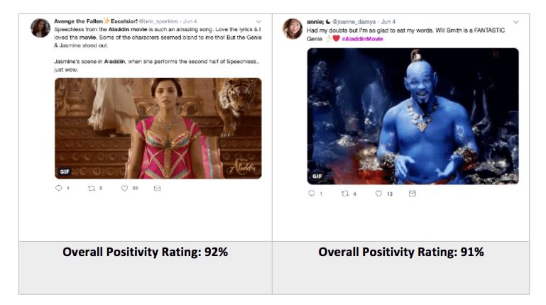
To account for the informal language used on Twitter, the NLP library used in this analysis weighs capitalization, punctuation, and emojis. Including these features in the analysis of sentiment allows it to be as accurate as possible.
Data Blending
SAP Analytics Cloud (SAC) allows any number of local or remote data sources to be present in a given story, allowing analysts to avoid the data silos which are often present in legacy reporting tools. SAC can join separate models together based on their corresponding dimensions in a process referred to as, Data Blending. This process makes it possible to draw conclusions from one model in relation to another and to identify patterns that can be used to establish a correlation between two sets of data. By linking the sentiment analysis model to the box office performance model, it is possible to analyze how the financial performance of a movie is influenced by the customer experience.
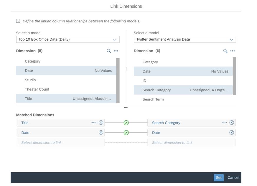
SAC makes it incredibly simple to couple models based on similar dimensions between them. For instance, we were able to link our Twitter and box office data models by their dimensions related to movie titles and dates.
By linking these two models and blending their data, visualizations can be created in SAC that displays information from both simultaneously. This allows us to discover connections on a larger scale, and focus on specific elements within each model. In the visualization below, the financial metrics of approximate ticket sales and studio revenue are contextualized and presented alongside a graphic related to the volume of posts made on Twitter and their overall sentiments. This uniform presentation makes it possible to then observe our X-Data and O-Data for individual movies and examine the relationship between their financial and social media metrics. For instance, the first image below shows data for the movie Booksmart, while the second shows the same data, but for the movie Brightburn.
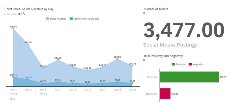
Visualization displaying box office and social media data for the movie Booksmart.
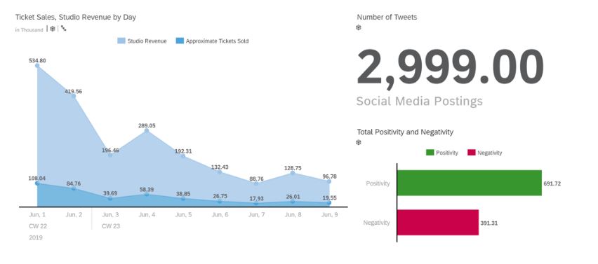
Visualization displaying box office and social media data for the movie Brightburn.
Reporting
Combining these two streams of data with the modeling capabilities of SAC allows for the creation of robust visualizations, which can be used to more effectively examine relationships within the data and provide context for key business problems. These visualizations provide an avenue for furthering the insights generated by the models created in SAC and offer a means of integrating predictive analytics technology with already existing data.
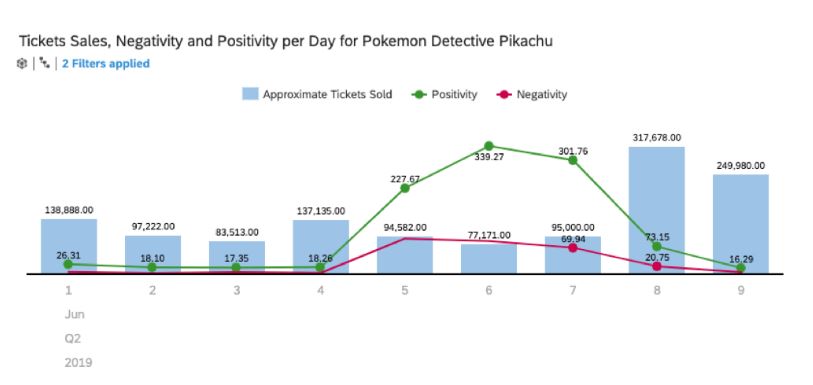
Certain functionalities allow for the creation of charts showing financial measures, such as unit sales, and measure them against Twitter sentimentality. This allows for the analysis of patterns that may predict the performance of a product. For instance, in the case of the movie Pokémon Detective Pikachu, a high volume of tweets that were predominantly positive were immediately followed by a spike in ticket sales.
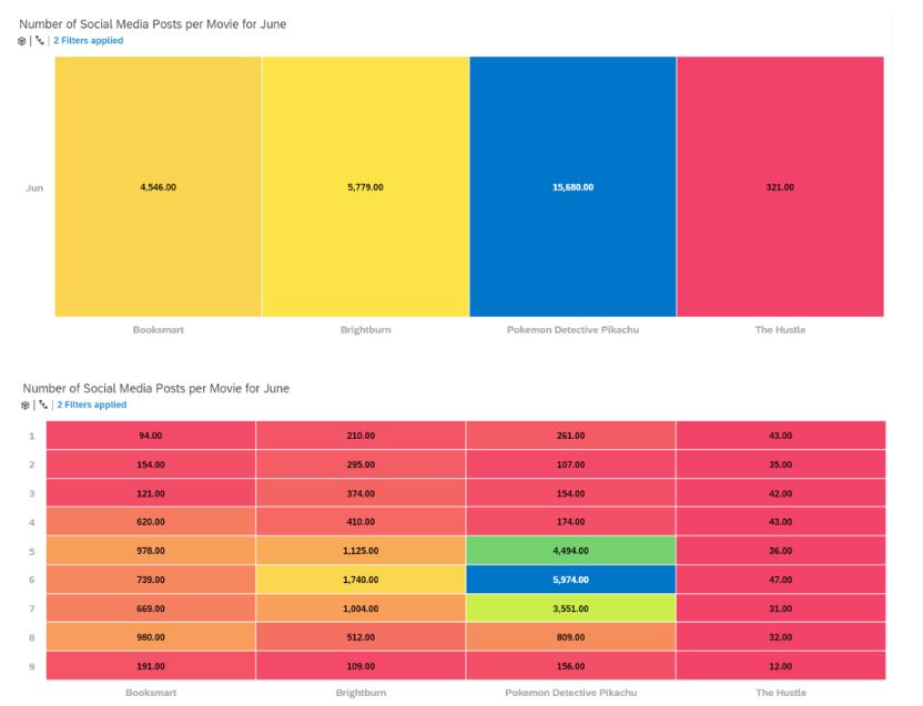
By mapping the number of Tweets posted that associated with specific films across days in the month of June, we can see how overall Twitter activity related to each movie varies as days go by. As demonstrated, this visual can display this data for the entire month of June but can be effortlessly adjusted to do so by day in order to offer more detailed insights. The visual language capabilities of SAC allow for this relationship to be expressed in a distribution chart that not only utilizes engaging aesthetic elements but takes advantage of these elements to communicate information directly and effectively.
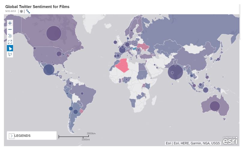
Modeling in SAC also allows for geo-enrichment, after which data can be presented in dynamic map visuals such as the one above. This map contains two layers of information related to our X-Data and O-Data. The size of each bubble indicates how many tweets related to our set of movies were posted in each country, while the shading of each country indicates the average positivity of these tweets in that region. The visualization separates the data in a way that makes it easy to measure activity by region and displays it in a coherent and interesting manner. In the same way that other charts can be filtered to highlight relevant data, these maps can be altered to focus on specific geographical areas or movies.
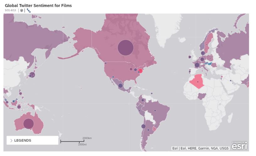
Map filtered to show global social media activity related to only the Pokémon Detective Pikachu movie.
Conclusion
Within this blog, we have examined some of the powerful ways in which experiential data can be used to better understand operational performance. Using SAP Analytics Cloud, we can visualize these insights and easily follow trends over time as well as compare them to different metrics, driving “Experiential KPIs”. Collaborative Enterprise Planning with SAC replaces data and process silos with seamless collaboration to present and analyze data from different angles. The visualizations presented to allow for greater discovery of patterns and causation that may have been previously hidden in large spreadsheets, divided among separate department and buried in vast amounts of data. With the facilitated discovery, drawing insight becomes less of a challenge and easier to transform into planning and solutions. The experiential economy is won and lost on data insights, and the analysis shown today are just some of the ways to achieve those insights.
This blog was created by TruQua’s Summer 2019 Interns, Nicole Aragon, and Treaank Patnaik. Stay tuned for our upcoming “Movie Watch” blogs, where we will continue to analyze social media trends for this summer’s hottest films.
About our authors:
Nicole Aragon is a Senior at the University of Texas at Austin, where she studies Management Information Systems in the McCombs School of Business. She plans on continuing her experience working in data science after college.
Treeank Patnaik is a Consulting Intern at TruQua, working on improving business intelligence by using advanced analytics and machine learning software. He is currently pursuing a degree in Mechanical Engineering at the University of Texas at Austin, along with certificates in Applied Statistical Modeling and Foundations of Business Administration.
JS Irick has the best job in the world; working with a talented team to solve the toughest business challenges. JS is an internationally recognized speaker on the topics of Machine Learning, SAP Planning, SAP S/4HANA and Software development. As the Director of Data Science and Artificial Intelligence at TruQua, JS has built best practices for SAP implementations in the areas of SAP HANA, SAP S/4HANA reporting, and SAP S/4HANA customization.
Editor’s Note
TruQua is currently hosting a closed beta for the Social Media analytics tools described in this article. If you are interested in joining the beta program, please contact js.irick@truqua.com
Movie Sources
Aladdin, Directed by Guy Ritchie. https://www.imdb.com/title/tt6139732/
Brightburn, directed by David Yarovesky. https://www.imdb.com/title/tt7752126/
Booksmart, Directed by Olivia Wilde. https://www.imdb.com/title/tt1489887
Pokémon Detective Pikachu, Directed by Rob Letterman. https://www.imdb.com/title/tt5884052
For more information on TruQua’s services and offerings, visit us online at www.truqua.com. To be notified of future blog posts and be included on our email list, please complete the form below.